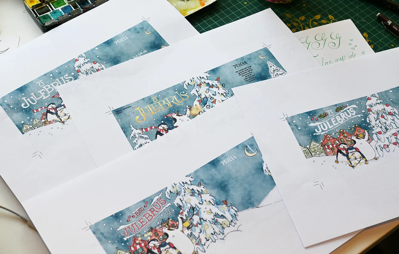
Hardangerbonden is a farm in Sekse in Hardanger. I designed three labels for their products: Eplebrus, Sprudlande Mamma and Naken, with different illustrations and a collective look.
Client: Hardangerbonden
Year: 2025
Labels for ciders and apple drinks
Sprudlande Mamma
The first design out was “Sprudlande Mamma”.
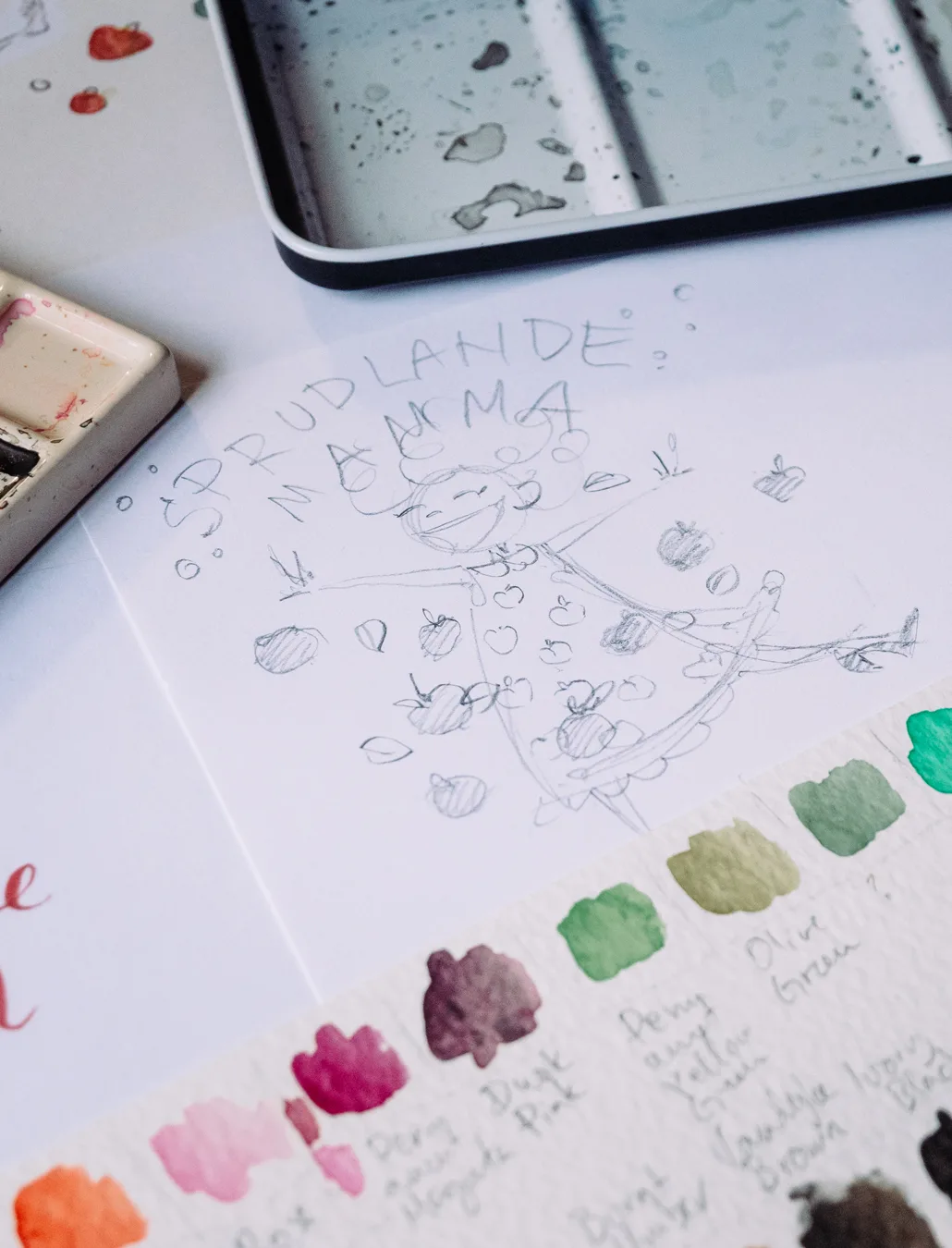
Ingrid Sekse, Hardangerbonden, visited my gallery in February and chose illustration styles that she thought would be a good fit for her three different products. For Sprudlande Mamma, she wanted a “Champagne lady”, a joyous celebratory woman dancing about the label.
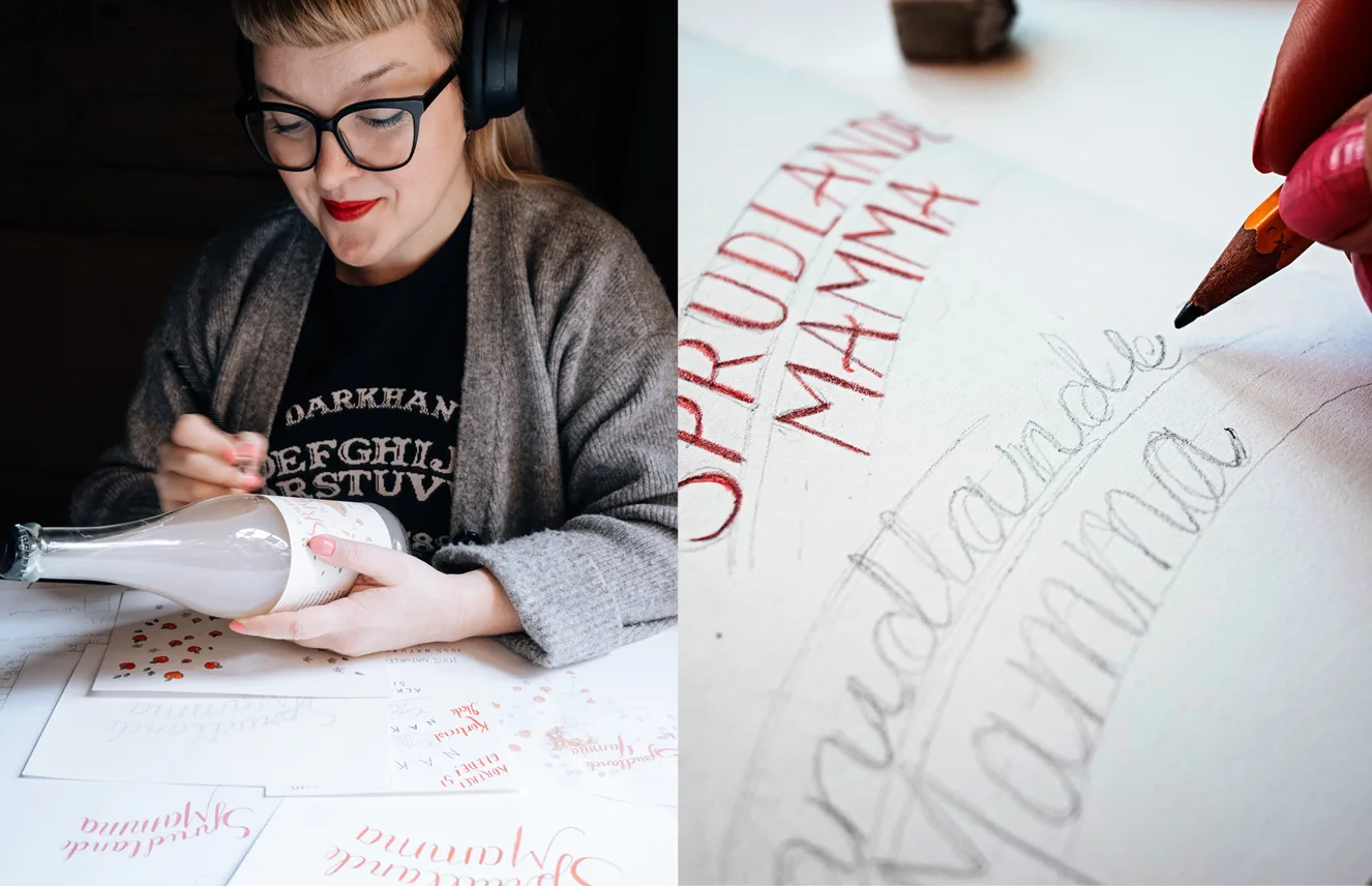
I love working by hand, where my pencils actually have some friction on paper and lines change with the paper grain.
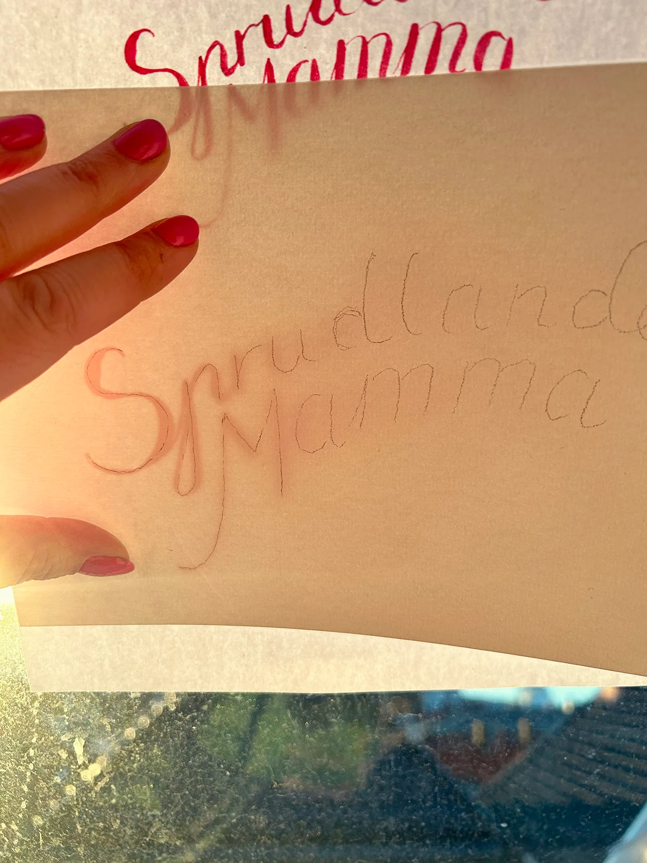
Before I bought my new light board I sketched and traced the lettering on my window backlit by low spring sunlight.
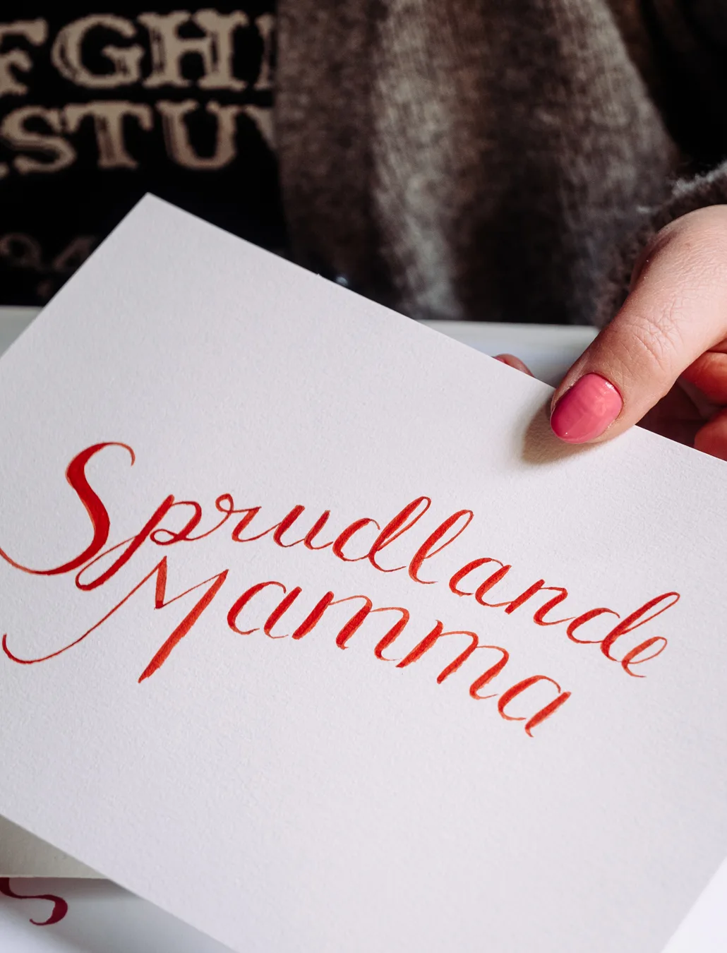
Finished lettering for the label, made with watercolour and brush.
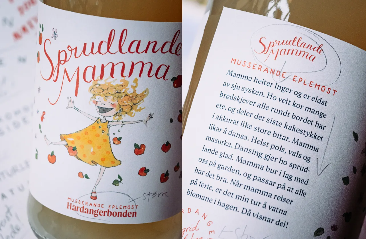
Printed the labels over and over again, did some tweaks, and printed again and tweaked some more until I was happy with placement. I also did the typography and layout of the designs.
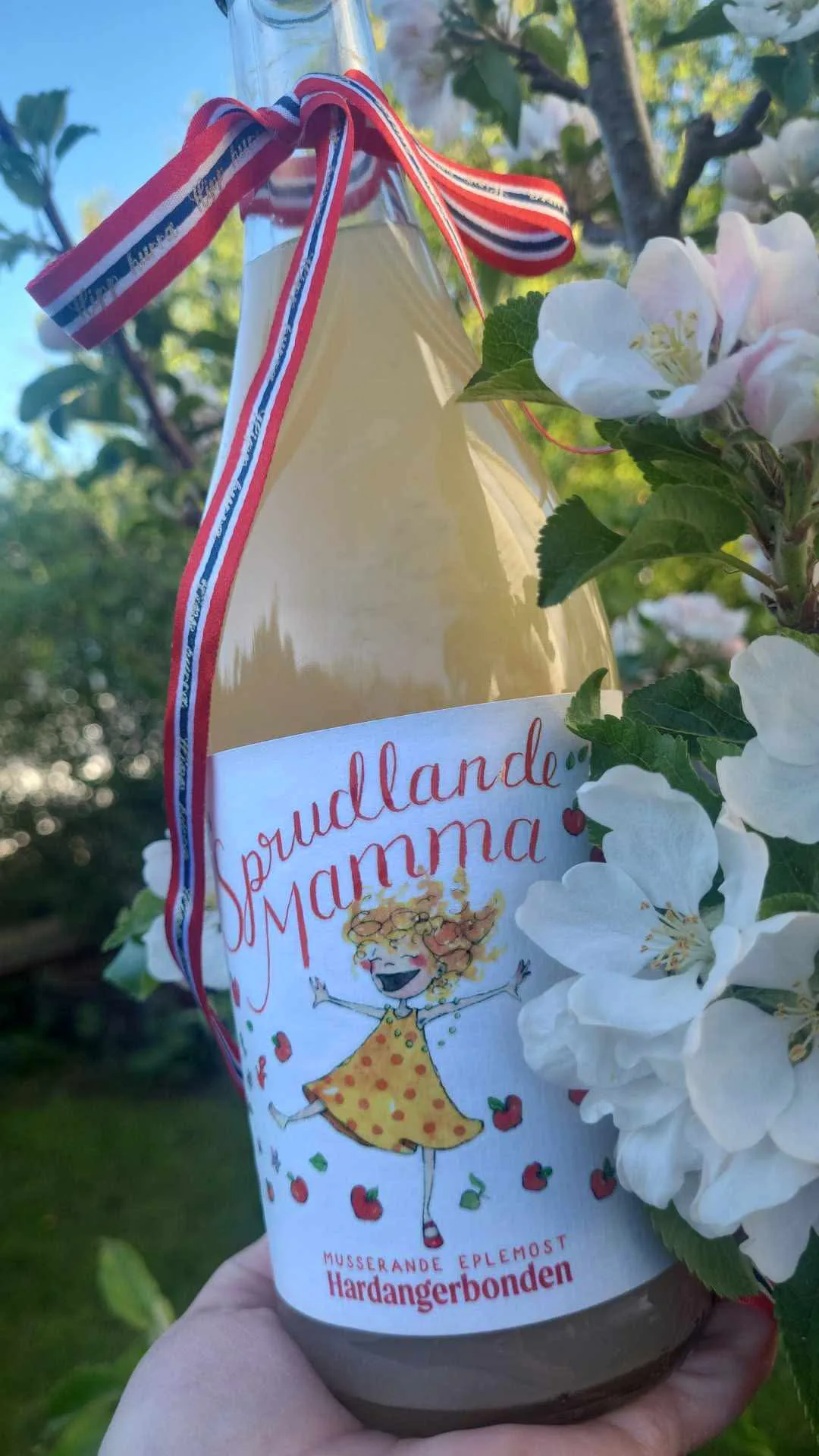
Finished label on cider bottle!
Naken
Label for non alcoholic cider made from ice cider production.
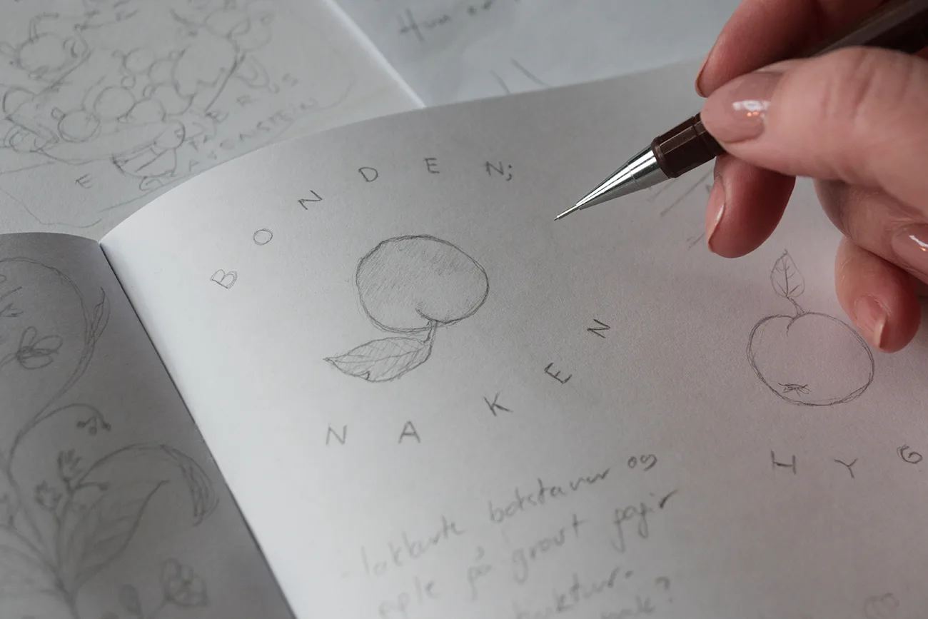
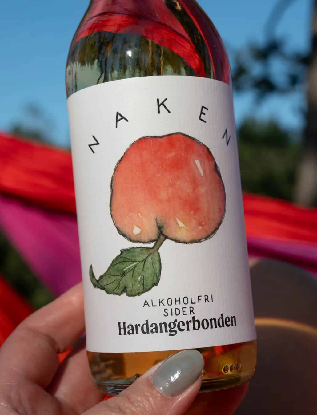
One of the briefs from Hardangerbonden was to create a label for a non alcoholic cider named “Naken” (Eng: “Nude”). Sometimes ideas strike and the finished label is actually very close to the initial sketch. Luckily Hardangerbonden was onboard with the apple bottom idea above, and I set to work. I wanted to create a look that would connect the three products, a cider, apple soda, and a sparkling apple drink, with different illustrations and a collective look, and I tested hand lettering the brand name and name of the products just to start somewhere.
I placed my apple bottom sketch with the lettering and scanned it, and pushed the contrast to give me a black outline on the illustration.
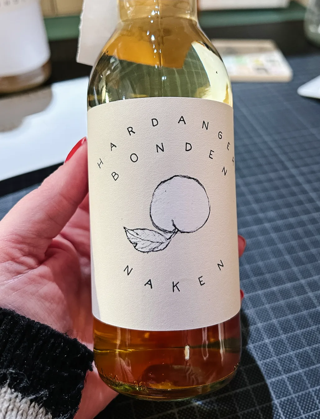
“Muck around and find out” applied, here I watercoloured in my sketch printout.
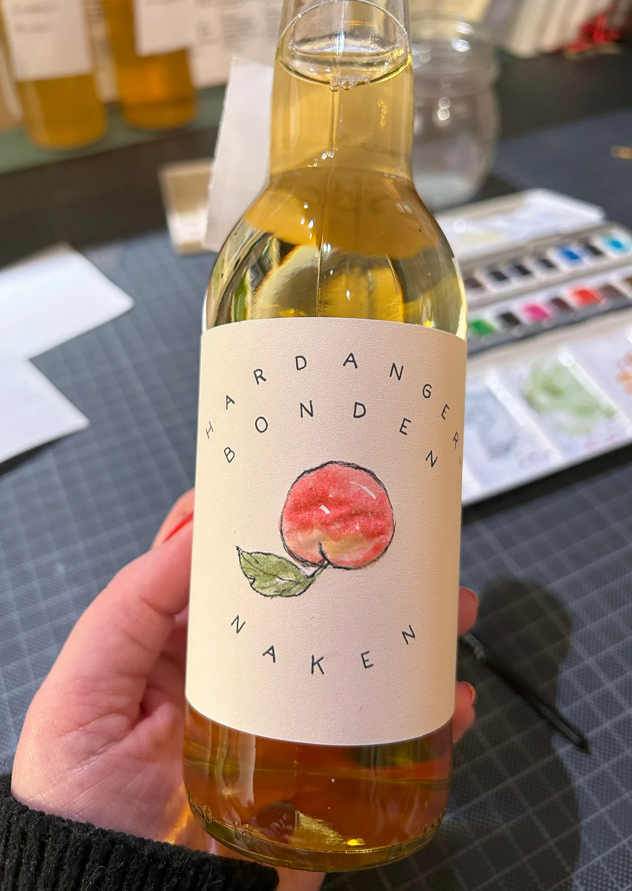
Played around with different lettering placements and started working in the additional information with pencil directly onto the bottle.
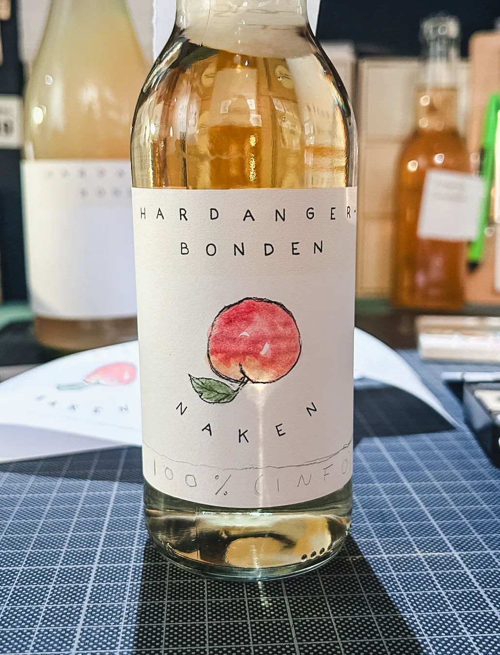
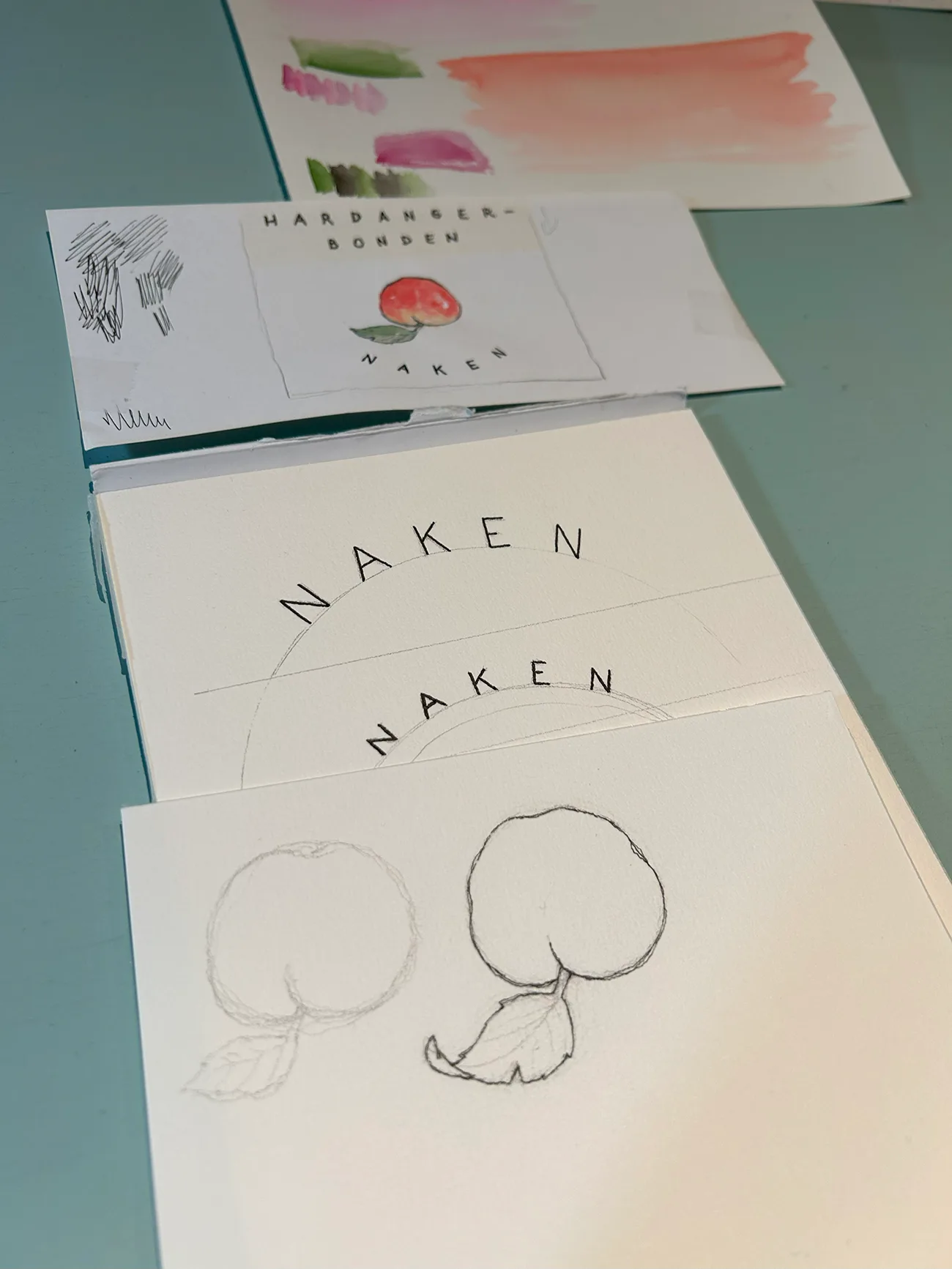
Lettering and inked out apple bottoms.
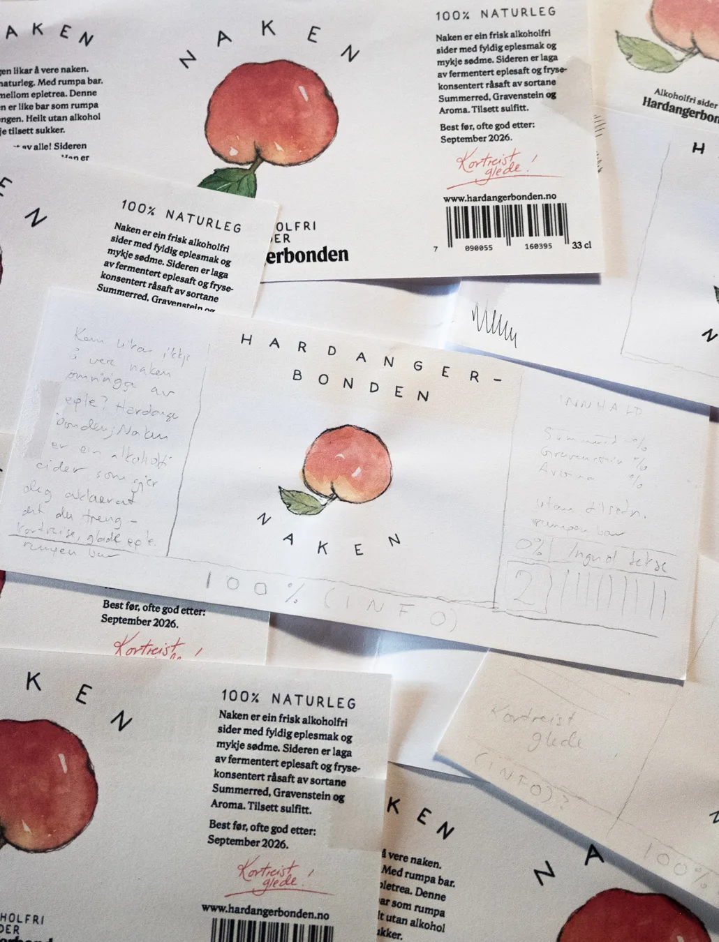
A few (quite a few) printouts and emails later, we had increased the apple bottom’s plumpiness, decreased the leaf, changed the text and changed it again, placed the name and type and played around with size vs apple, placed barcodes and content info, created a font with my hand lettering so that I didn’t have to type out everything for each text placing, made text block font choices, made some additional lettering and smaller illustrations for Hardangerbonden’s “seal of approval”, and emailed some more about the paper quality and lacquer, which turned out sooo pretty for the final label.
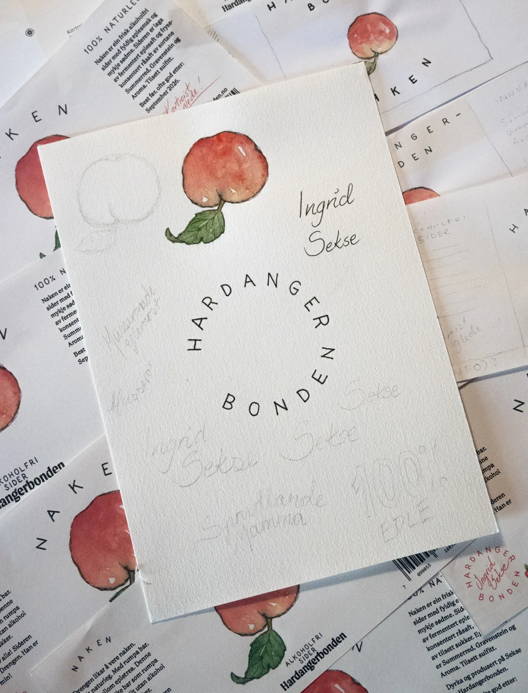
And here is the final result!
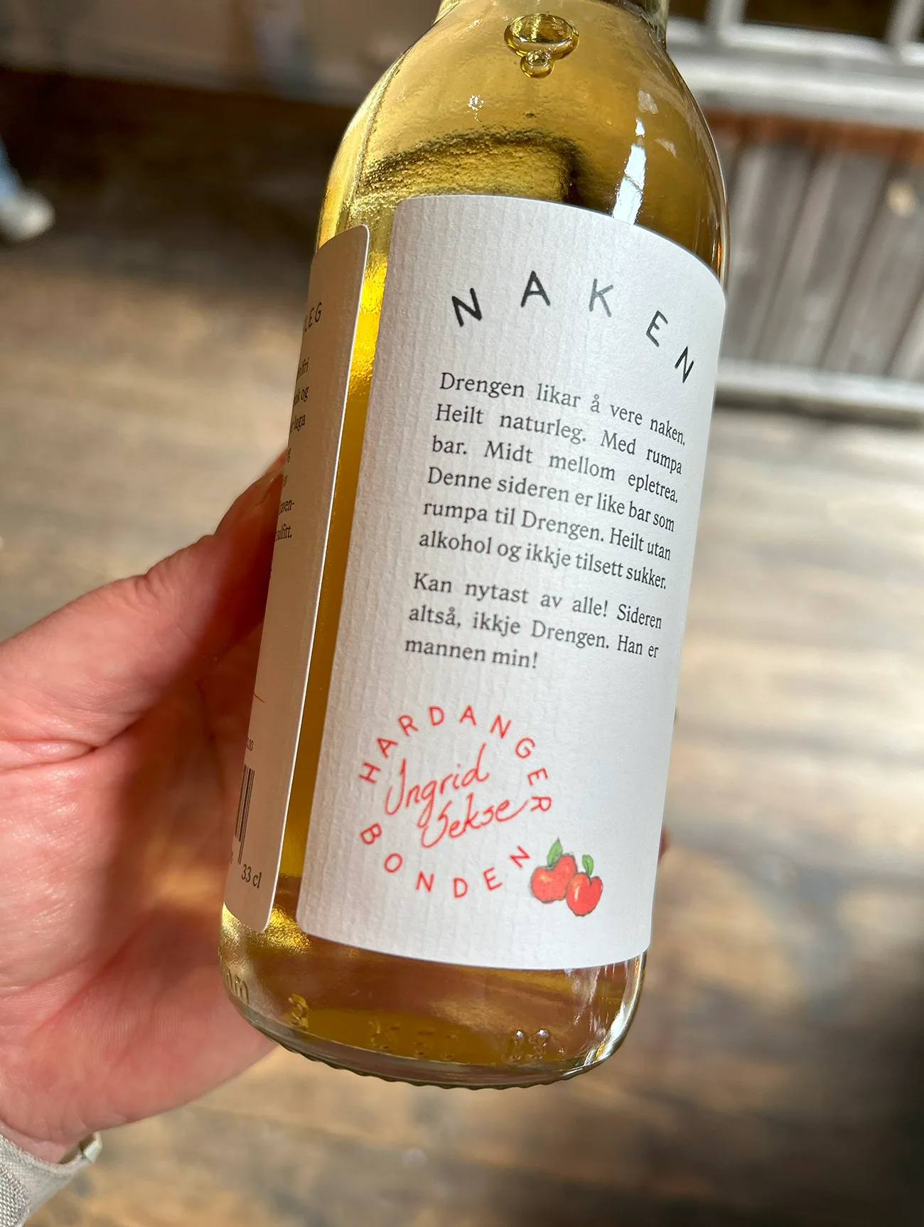
Bottoms up;)
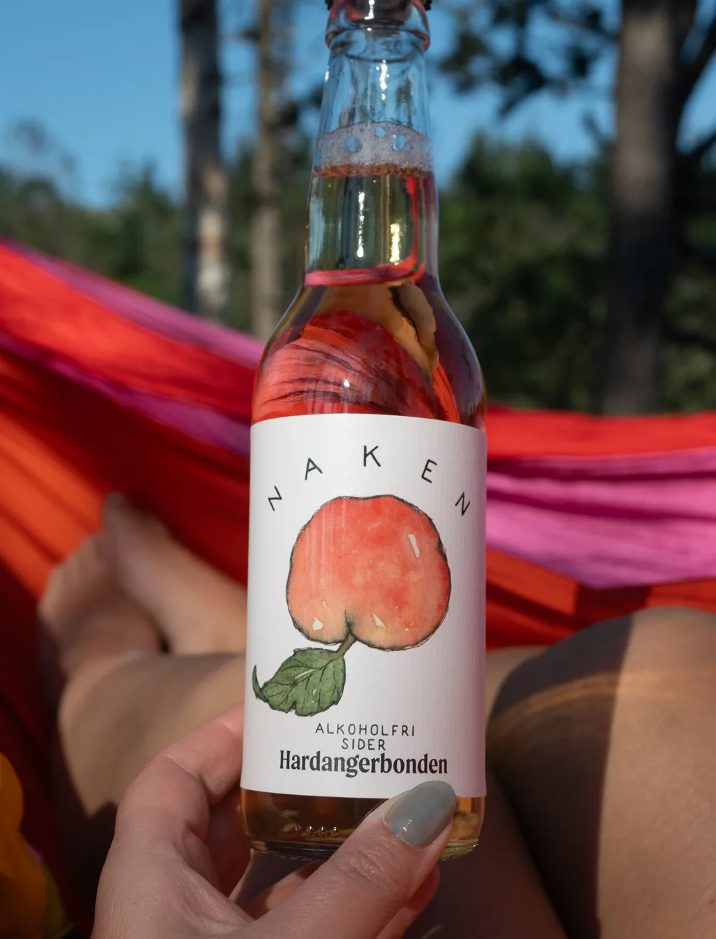
The ciders are for sale in my studio at Bryggen, and with Hardangerbonden from their farm in Sekse in Hardanger.