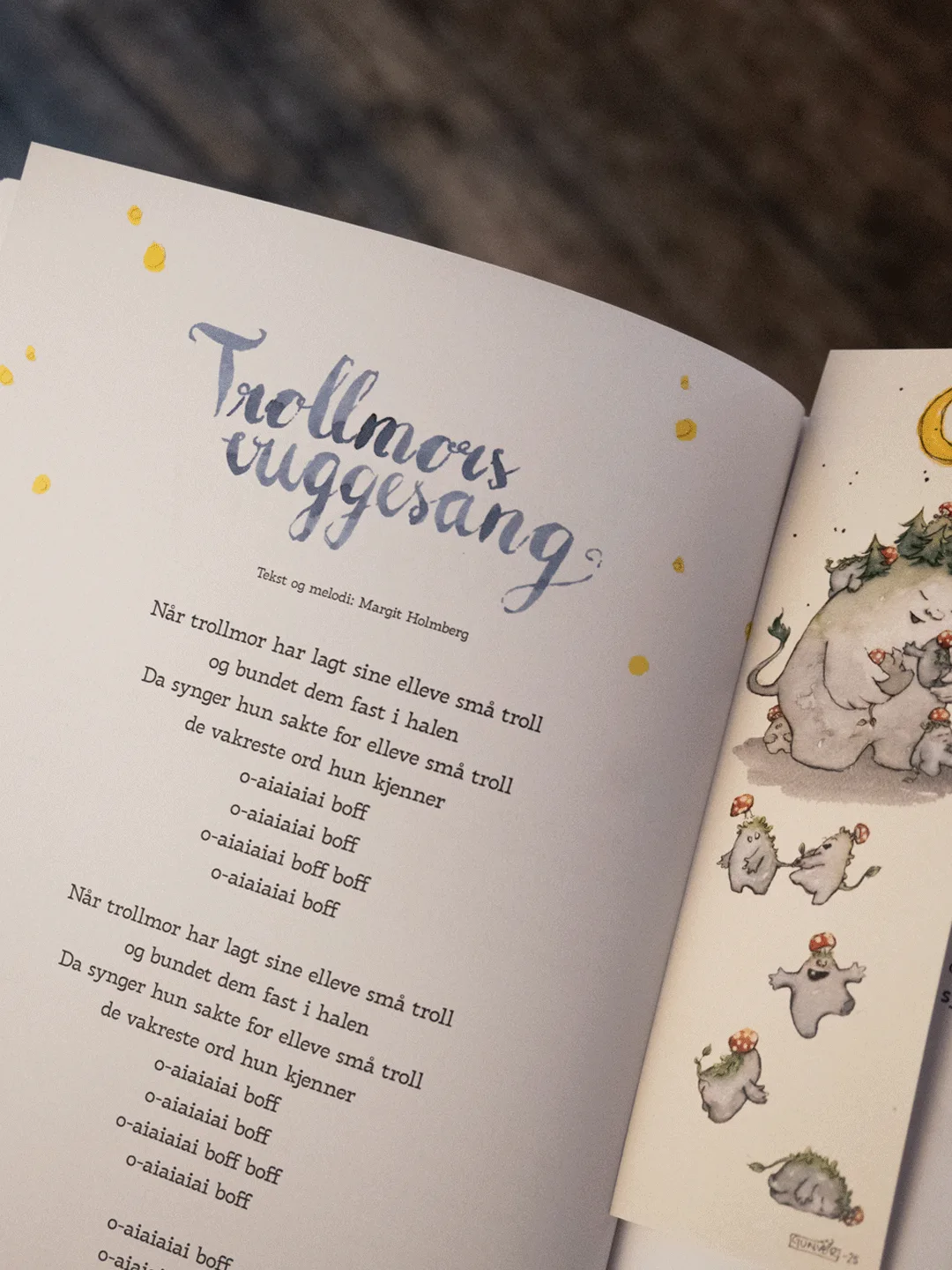
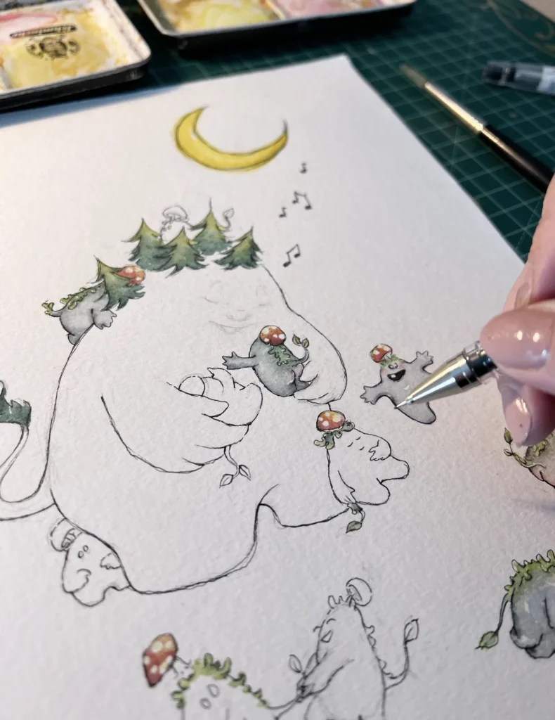
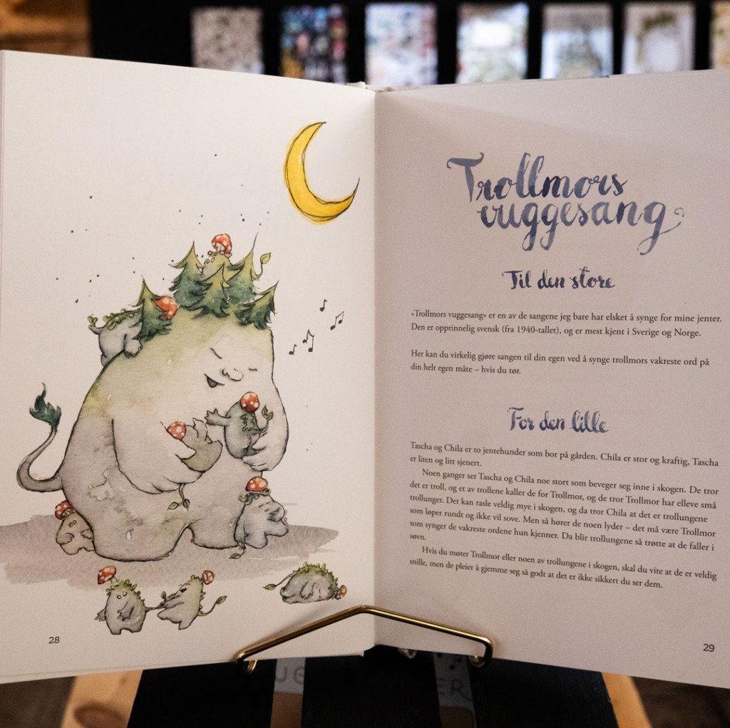
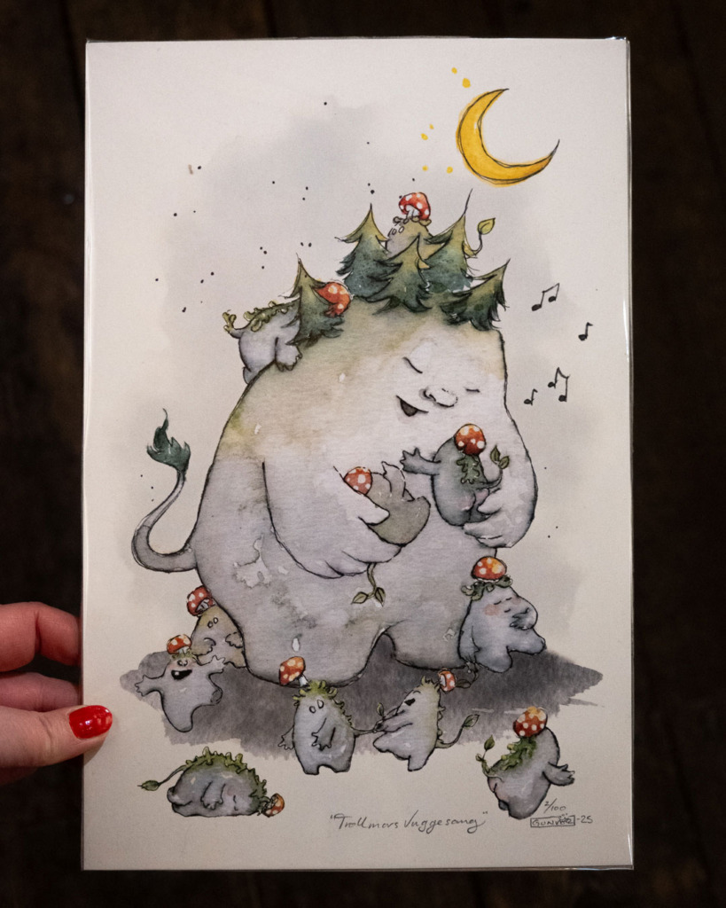
Sissel and her team asked me to illustrate a children’s song book. I loved this project; there are worse ways to spend your working days than drawing to lullabies. The deadline was quite tight, so the publisher re-used illustrations from earlier projects, and I painted new ones for the songs that didn’t have any.
Client: Sissel Kyrkjebø/TNT/Bonnier Year: 2025
Illustrations for a songbook
Brief & Process
Sissel and her partner had written and recorded an album of lullabies, and wanted a songbook to go with it. Each song would have an intro illustration, the song text and the chords, so that people could play and sing along to the album.
This is one of the shortest deadlines I’ve had on a large project. My designer, Kjetil Waren Johnsen from Wisuell Design, and editor Tonje Tornes were great partners to have during a tight schedule. Tonje has a long career behind her in publishing, and I think the reason this rocket of a project worked out was that all of us knew what we were doing. And they trusted me to know what I was doing. No project is without its snags, but I’m pleased with what we made happen in such a short time.
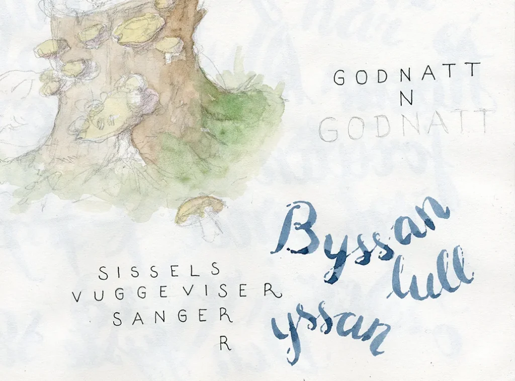
Since I, of course, didn’t have much time, I decided to draw out all the titles by hand. The digital hand-drawn font just didn’t spark joy.
Sissel wrote little stories and instructions for both kids and adults in the book, giving the songs context or fun details about where they originate.
I was approached by Ulriken643 / Skyskraperen Restaurant to illustrate and design two sodas that were already under production with 7FJELL Brewery; one with taste of red berries and one with orange. They were to be sold at the restaurant “Skyskraperen” at the top station of the gondola at Mt Ulriken, and in their cafe shop.
Client: Ulriken Year: 2024
Illustrations for soda cans
Brief & Process
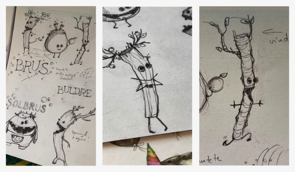
The name and concept of the sodas were still being developed, so my sketches for our first workshop were loosely based on the place itself, Mount Ulriken, the hikes, the vegetation, and energetic stick figures representing playful kids enjoying nature. Just to start somewhere, and because I will use any opportunity to have to research moss and fungi.
The good people behind Ulriken/Skyskraperen had toyed with creating some new character names for their gondolas or mascots, so we brought the names “Ulrik” and “Ulrikke” into the sketch process. As much as I loved the first creature sketches – during our workshop we did start to lean towards a more colour blocked look that they might not fit into.
For the carbonated colour play they had in mind we abandoned the idea of stick figures and nature creatures, to concentrate on energetic and colourful fruit monsters burping bubbly fruit juice. We kept the idea of the hand lettered typography throughout.
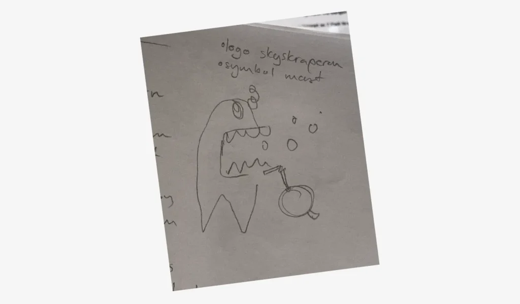
One of the drawings that popped up in my sketchbook during our workshop – it became the starting point for round 2 of the sketches.
This is why I love doing workshops instead of having meetings. Then we can sit and sketch while we talk and test things out straight away, and pick up on each other’s enthusiasm for a specific topic or develop details from the sketches and notes. I later continued work in my sketchbook, while also churning out ideas on how to name the sodas and show what they taste like.
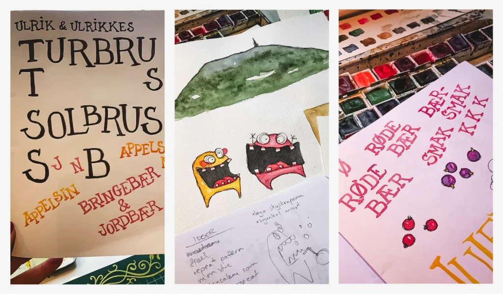
Adding some foliage for the background, printing out and moving things about, and doing several different watercolour tryouts for the burping fruit and berry monsters.Testing out different hand-lettered naming of things.
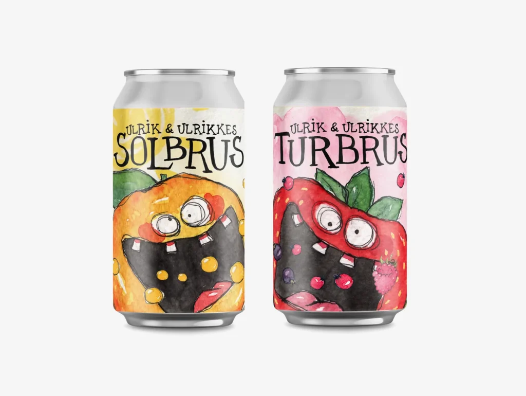
We decided that both sodas would carry the names “Ulrik & Ulrikke” and then the name of their drink type, “Turbrus” for the berry taste, and “Solbrus” for the orange, with the actual taste name written out on the side.
Burping berries.
I have probably a million exports of versions of the label design and detail typography for the back along the way, and for the various texts on the back that we worked on collaboratively. (I ran out of letters in the alphabet to use as file name versions.) These are the final edits that I sent off to print, and I’m happy I kept the old versions and sketches, I’ll probably find uses for them later.
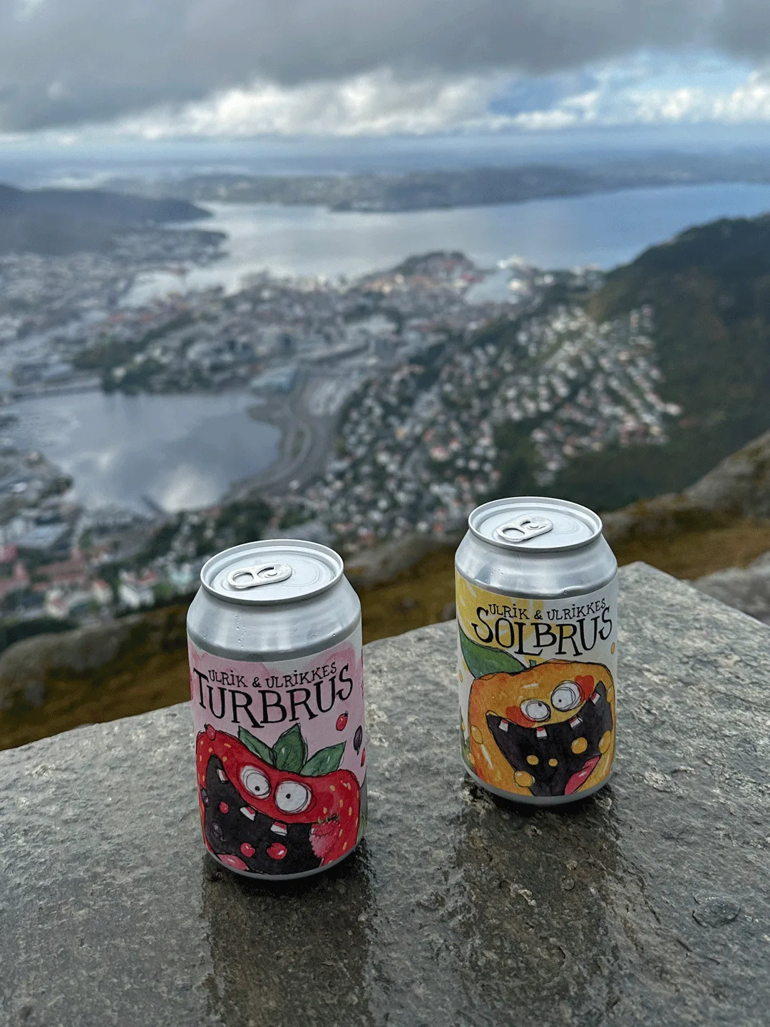
Underneath is a photo the Ulriken/Skyskraperen squad sent me the day we got the delivery from 7FJELL, it was so fun to see the sodas finally roaming the wild.
This little girl was not used for this project, but I liked the character so well that I kept her for a different project.
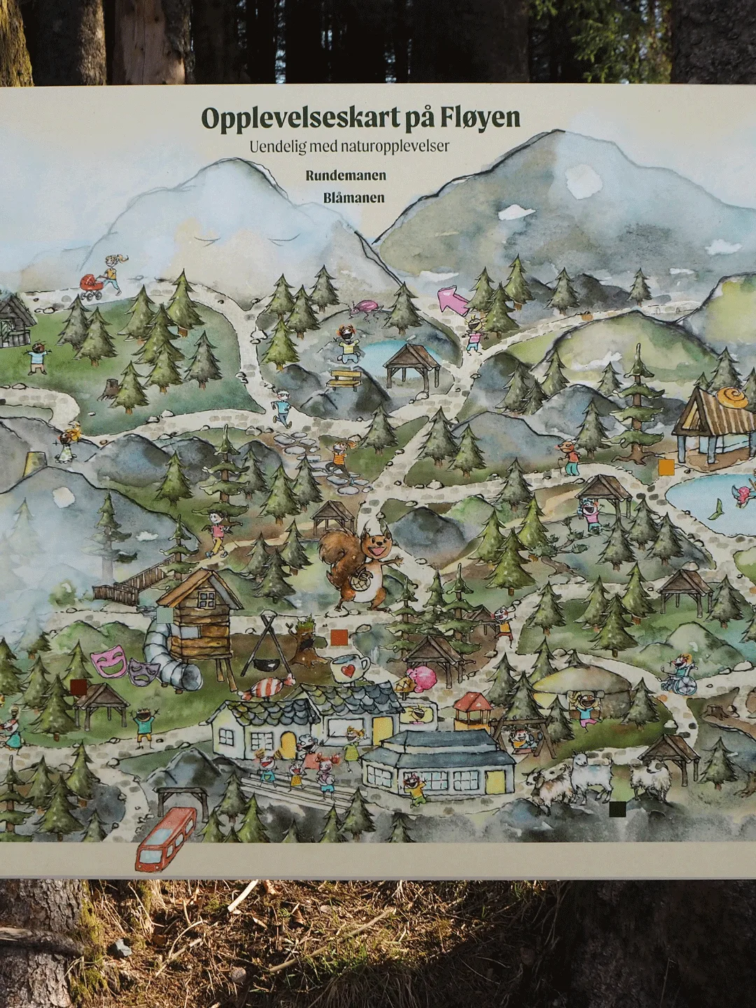
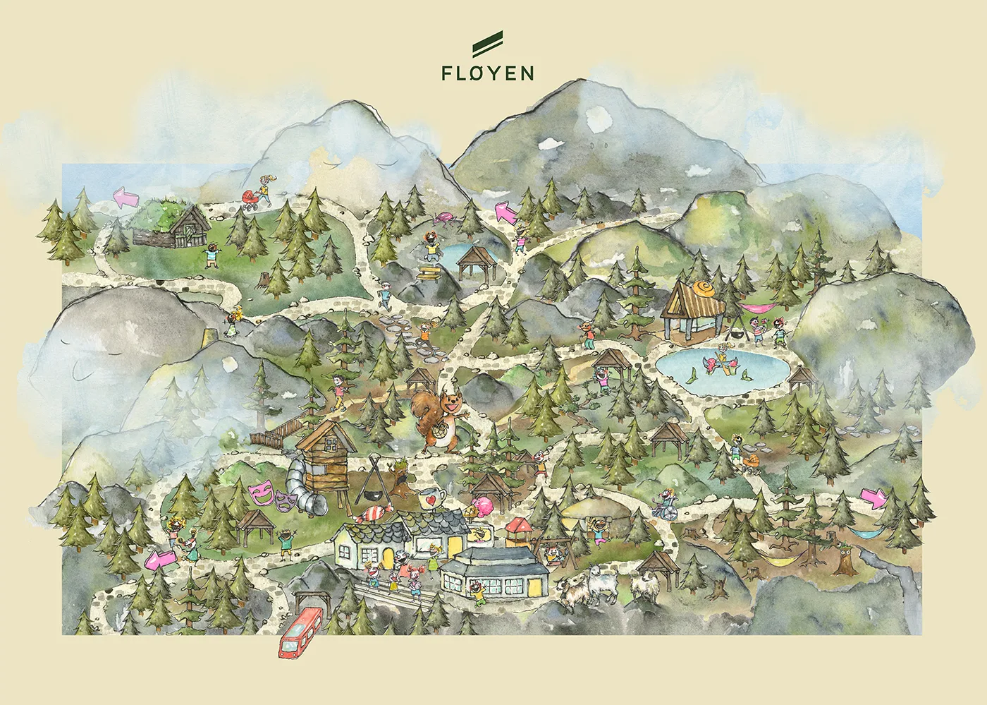
I was approached by Fløyen to design a map covering the different pathways and activities at Fløyen, and spent a good few months trailing every nook and corner to make sense of the normally red dotted lines. Good fun, and almost a treasure hunt!
Client: Fløyen AS Year: 2021
Illustrated map of Mt Fløyen
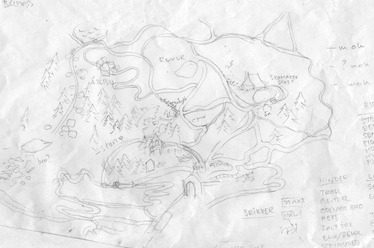
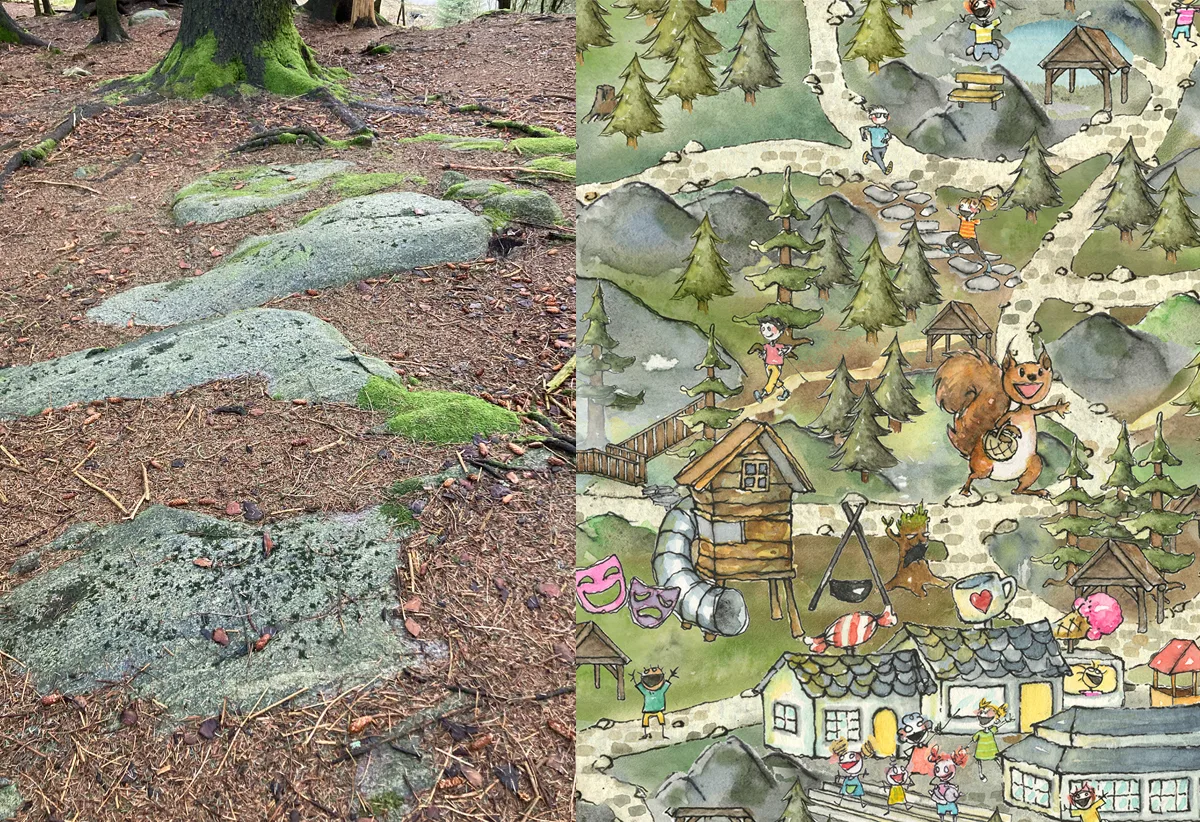
Sometimes things just line up neatly. I made this sketch after a walk at Fløyen, thinking the paths could be a fun starting point for a boardgame. The same day Fløyen A/S approached me asking me to do a map for them. The map would show experiences and places at the top of the funicular (playgrounds, lakes, shops, places to rest and explore, cafés, trails, hidden gems, best hammock views) and be readable and understandable for kids, with walks within half an hour reach from the top station. This meant I had to pay extra attention on my walks, what was actually there to discover.
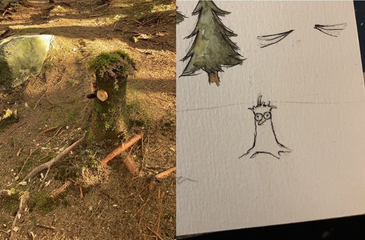
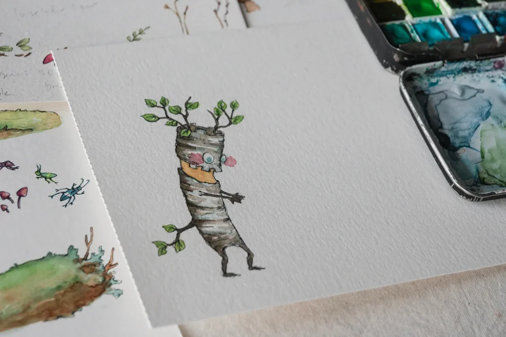
Like this guy. Not an essential part of navigating Mt Fløyen, but a treat to run into. (On the map: The treestump-creature is located in the forest after passing the goat house.)
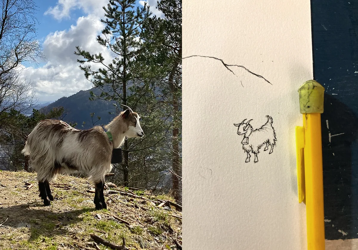
And of course the goats. With pencil for scale. Adding the goats is of course another non-essential detail for mapping (and they move around) but this map was to show things you could bump into. Maybe even spot people you know. I’ve added a few people I know, and they’re running towards each other on the rocky path in the picture below.
I varied the colour scheme roughly according to topography, so that rockier areas were more grey, mossy undergrowth were more green, and dense pine forest floors were brown. I’d love to have thrown in the different greenery more accurately, but I had to restrain the level of nerdy details or I would never finish.
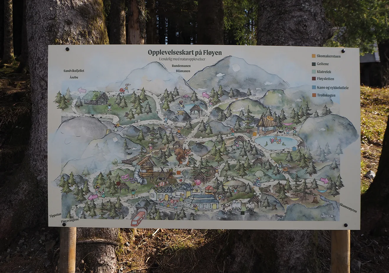
You can find the map at the first crossing after leaving the top station.
I’ve done several different tasks for Fløyen over the years, so I decided to collect them all in one place – from the shop and a map to signage and characters for their Nature School.
Client: Fløyen AS Year: 2020–2025
Illustrations for a shop, maps, posters, signage and a nature school
Shop illustrations (2020)
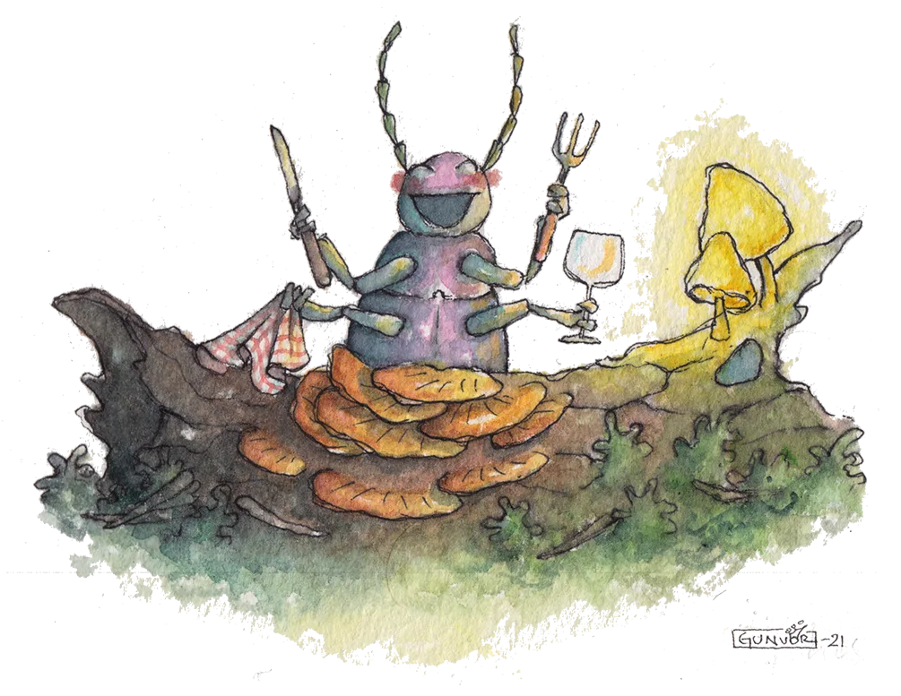
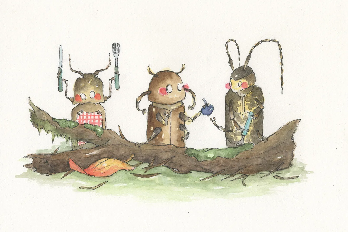
I was asked to design for the shop at Mount Fløyen in December 2020. The originals made for the shop were all forest themed, portraying the secret lives of forest creatures. I also made mycology postcards and a poster to guess fungi taxonomy.
Map (2021)
A map of the paths and activities at the top of Mt Fløyen, made to be readable and understandable for kids.
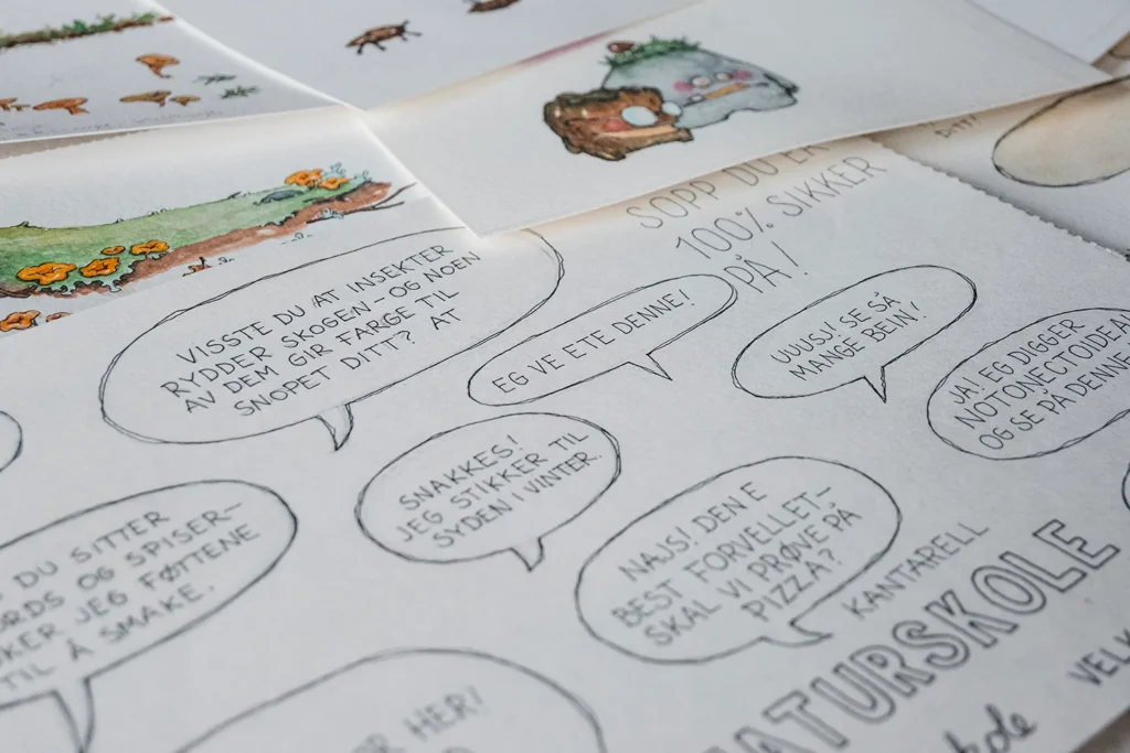
Together with the map I made illustrations for their nature school trail. The illustrations are used when teaching visiting classes about the diverse life in the undergrowth at Mt Fløyen, and how we are dependent on the smallest creatures in so many areas of our lives. You can find plaques with drawings and info, and follow a trail where you answer questions and tick off “geotags” on a printed map.
Carriages & goats signage
I drew the carriages and the goats for signage.
Writing course / Bookstarter (2020)
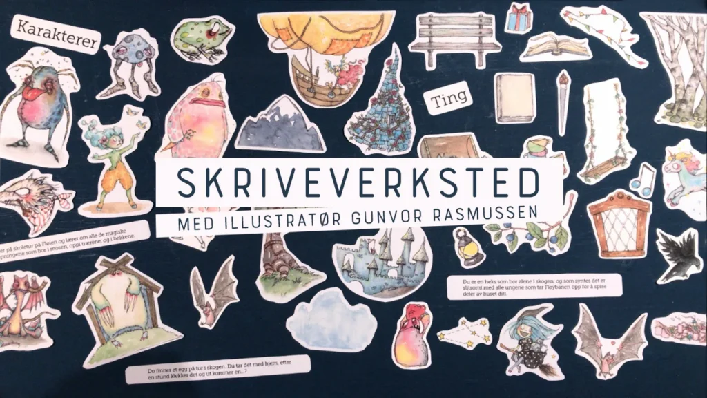
I was asked by Fløyen Activities to create a short course or reading session for kids and adults to participate in together, outdoors or indoors at Mt Fløyen. I ended up creating a writing session where I gave worksheets and templates for story building, so participants could leave after an hour with the outline for a story.
Nature School (2024–2025)
The latest thing I did was also the biggest task: creating characters for the Nature School – forest guardians, drawings for the walls, and life-size figures.