
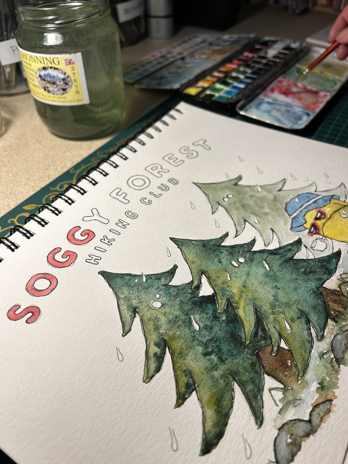
Soggy Forest Hiking Club
T-shirt idea that formed during an especially soggy walk.
Looking though my camera roll it seems all my walks are soggy. This one was also at Fløyen, like my last misty mountain visit.
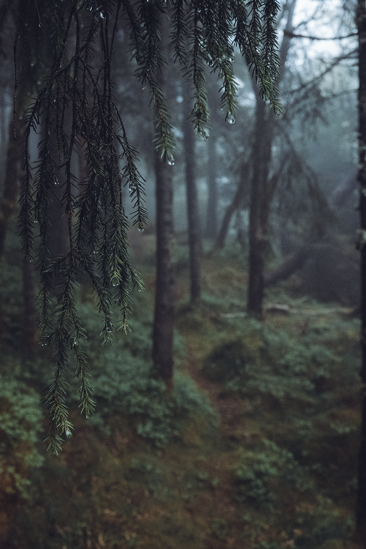
The colour scheme in this photo reminded me of underexposed hiking photos from the 1970’s and 80’s; grainy, with dark greens and browns and a blue tint. Which led me to think about retro t-shirt designs from foresty summer camps, and *pop*; “Soggy Forest Hiking Club” was born.
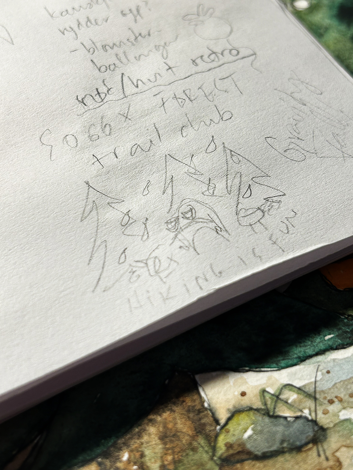
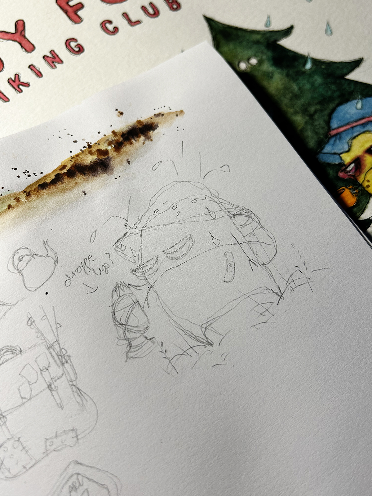
A quick sketch so not to let the idea slip.
The idea of hiking is wonderful, but sometimes, when you’re actually there, nature is itching. So I set out to experiment with some colour mixes that would convey ultimate soggyness. Greens become a lovely deep hue when wet, and since drips means overcast I tested out a granulating black tint that would dampen the greens I had in my palette. I didn’t use a contrasting colour or other greens to do the shading, because I also had in mind screenprinted t-shirts with limited colour options, where darker areas would just be printed in black.
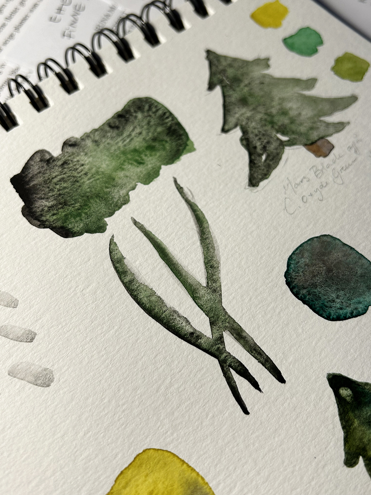
Fot the character I wanted a little misfit that was a contrast to the background. With garish coloured gear. One “80’s hiking colour” I remember (from a tent we had) was bright orange.
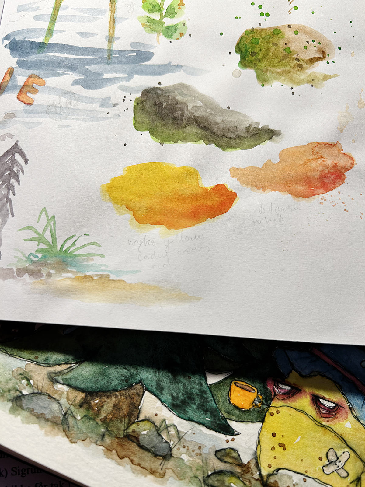
A few tryouts with red and yellow hues.
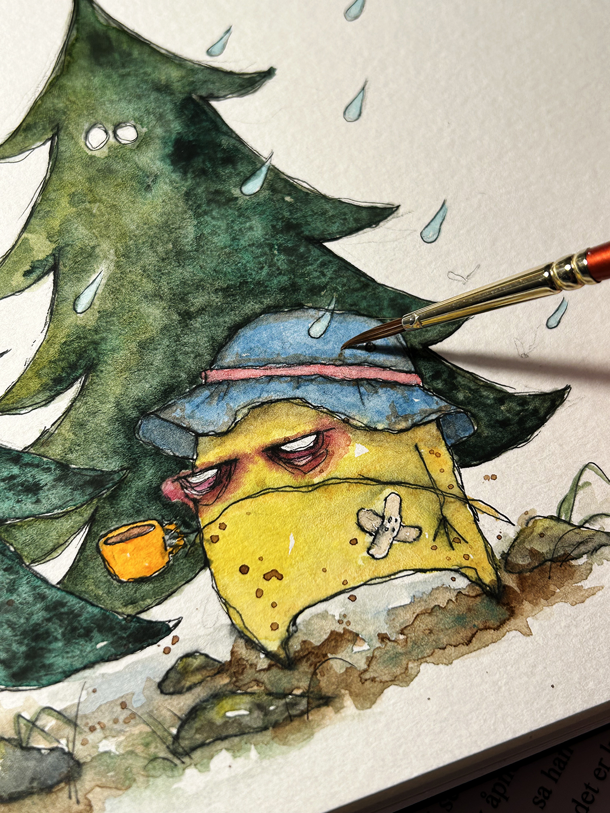
Channelling some muddy mood.
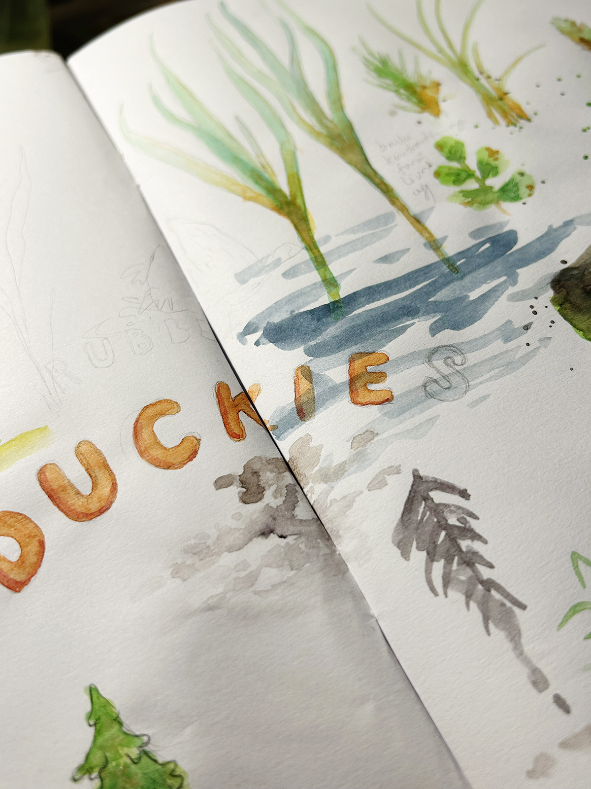
I drew this font out earlier on the same walk after seeing some really cute baby ducks, and when I came up with the t-shirt motif it of course had to be the type of font to use.
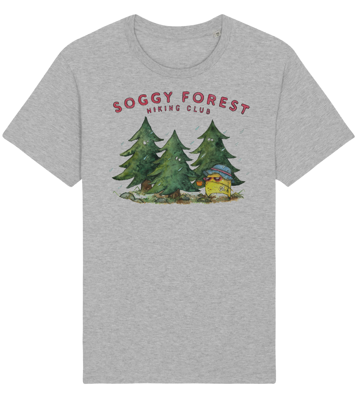
Here is a mock up of the design, I need to sleep on the colour of the shirt, but think grey is a suitable colour for the soggy club. Don’t know the production date yet, but I’ll post on my Instagram as soon as the t-shirt is in stock in my shop at Bryggen:)