Soda labels for Ulriken/Skyskraperen
Yummy treats crafted at 7FJELL Brewery in Bergen.
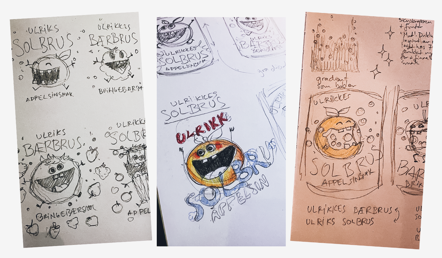
I was approached by Ulriken643 / Skyskraperen Restaurant to illustrate and design two sodas that were already under production with 7FJELL Brewery; one with taste of red berries and one with orange. They were to be sold at the restaurant “Skyskraperen” at the top station of the gondola at Mt Ulriken, and in their cafe shop. The name and concept of the sodas were still being developed, so my sketches for our first workshop was loosely based on the place itself, Mount Ulriken, with taking hikes, the vegetation, and energetic stick figures representing playful kids enjoying nature. Just to start somewhere, and because I will use any opportunity to have to research moss and funghi.
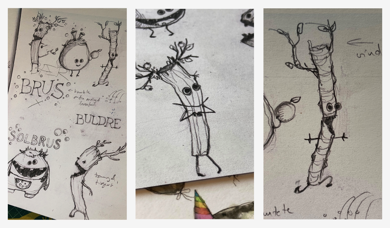
The good people behind Ulriken/Skyskraperen had toyed with creating some new character names for their gondolas or mascots, so we brought the names “Ulrik” and “Ulrikke” into the sketch process. As much as I loved the first creature sketches – during our workshop we did start to lean towards a more colour blocked look that they might not fit into.
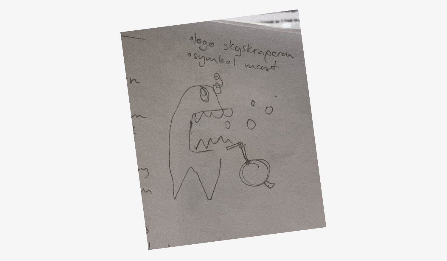
For the carbonated colour play they had in mind we abandoned the idea of stick figures and nature creatures, to concentrate on energetic and colourful fruit monsters burping bubbly fruit juice. We kept the idea of the hand lettered typography thoughout.
This is why I love doing workshops instead of having meetings. Then we can sit and sketch while we talk and test things out straight away, and pick up on each other’s enthusiasm for a specific topic or develop details from the sketches and notes. I later continued work in my sketchbook, while also churning out ideas on how to name the sodas and show what they taste like.
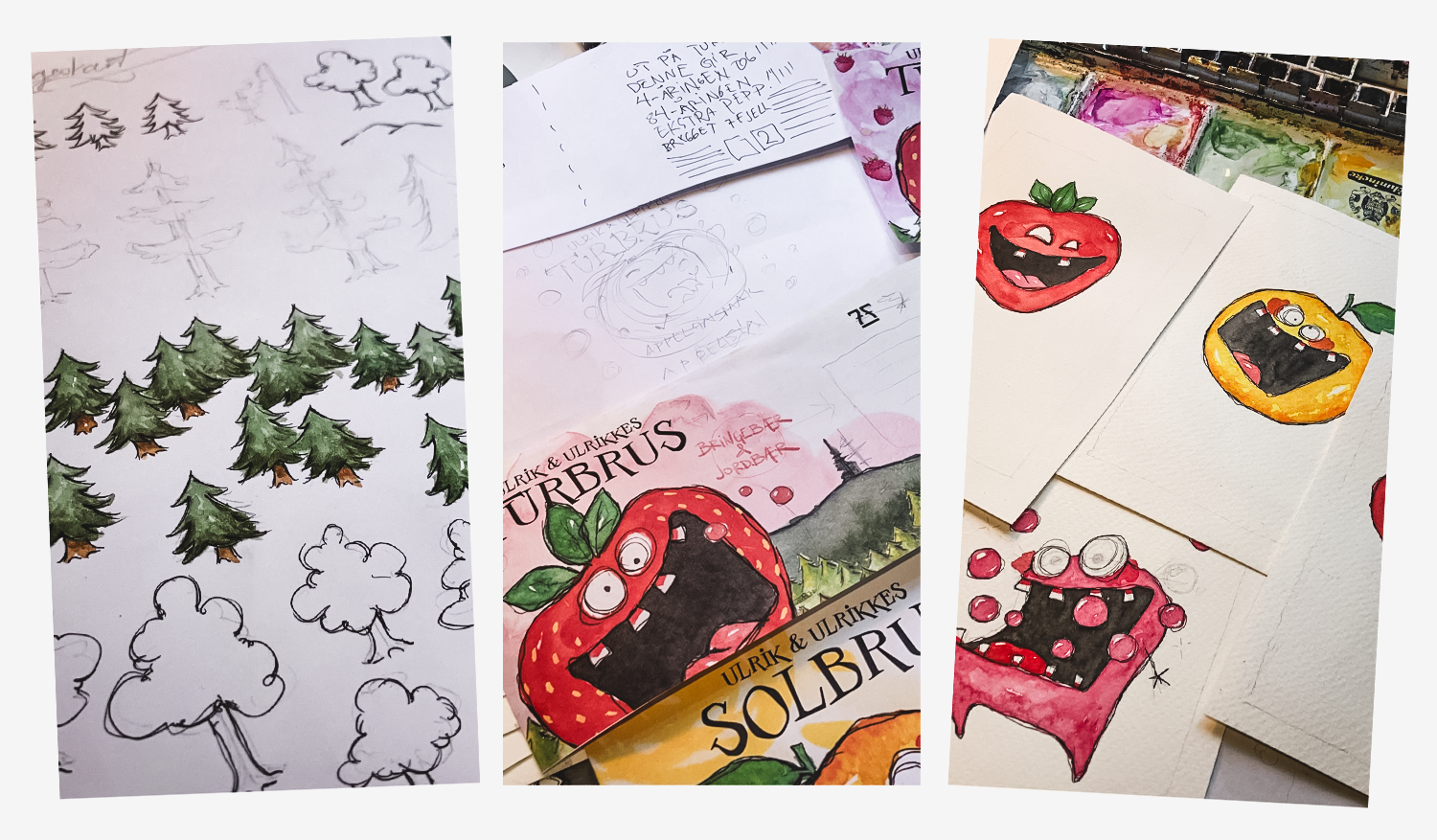
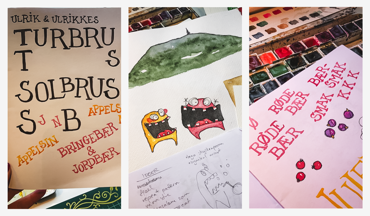
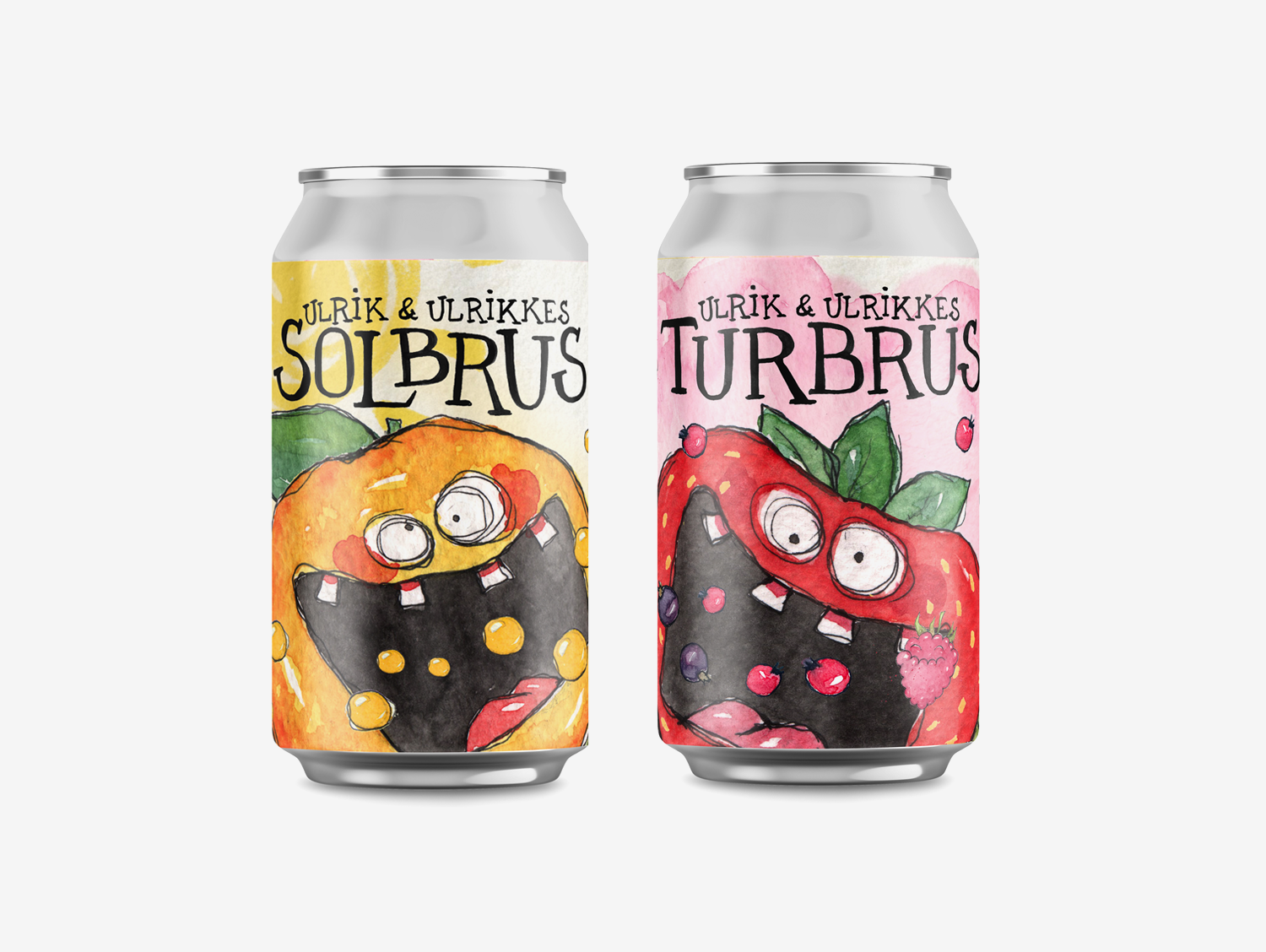
We decided that both soda’s would carry the names “Ulrik & Ulrikke” and then the name of their drink type, “Turbrus” for the berry taste, and “Solbrus” for the orange, with the actual taste name written out on the side.
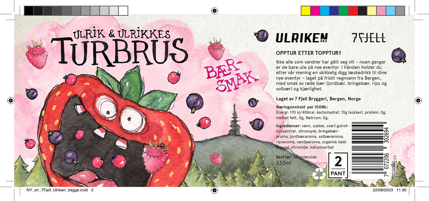
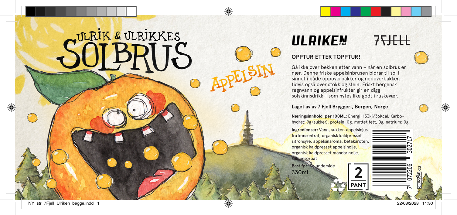
I have probably a million exports of versions of the label design and detail typography for the back along the way, and for the various texts on the back that we worked on collaboratively. (I ran out of letters in the alphabet to use as file name versions.) These are the final edits that I sent off to print, and I’m happy I kept the old versions and sketches, I’ll probably find uses for them later.
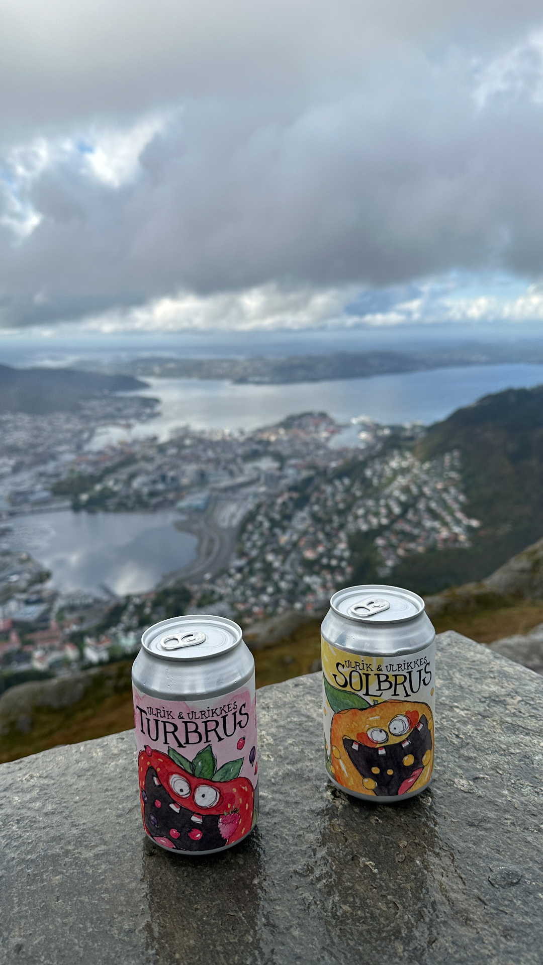
Underneath is a photo the Ulriken/Skyskraperen squad sent me the day we got the delivery from 7FJELL, it was so fun to see the sodas finally roaming the wild.